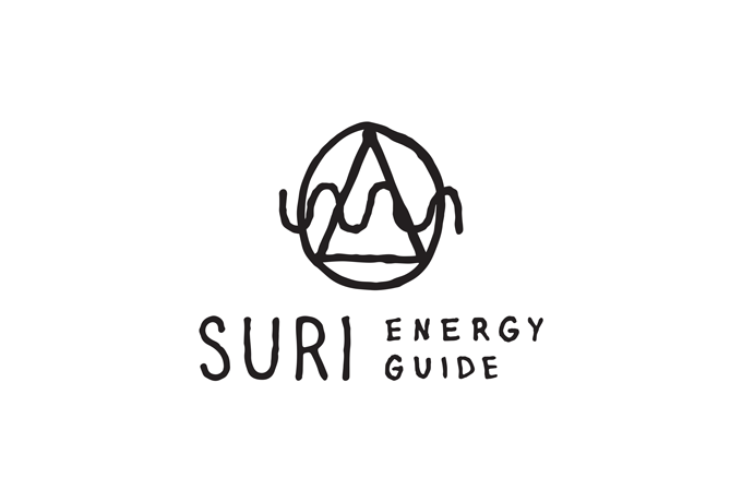
Surinderpal and I collaborated thoughtfully as we developed a unique image for the brand. We wanted Suri Energy Guide to stand out amongst the holistic business community. Our partnership ended up cultivating an iconic look and attractive presentation that will continue to propel the company and its mission forward.
Print and Web Properties
Once the Suri Energy Guide logo was established I set out to construct a visual system for all typical media. The use of kraft paper played well with the whimsical character of the logo. Suri and I felt that accessibility in all core media channels was a critical component of the brand. We wanted potential clients to feel like Suri’s space in the yoga and energy community was extremely approachable.


Handbooks and Certificates
Suri required a number of print resources for workshops and general promotion. The projects put my typesetting skills to work. Through all my work with Suri Energy Guide I’ve limited all pieces to just a couple fonts. The controlled approach to the type system has helped further define the brand.


Social Media


Humble Hearts Co.
Suri’s vision for creating a community service arm of Suri Energy Guide culminated in the formation of Humble Hearts Co. The collective required a mark and brand all its own. The icon we formed represents the entity’s mission of humble folks coming together and serving community.
Logo Variations and Colors
The original thought behind Humble Hearts Co. was that a number of individuals would be contributing to the collective group. This meant that many hands would be touching pieces of the identity. Setting up general guidelines and direction for the organization was imperative.
I set Suri up with a number of different logos and a color guide that she could provide to contributors working with her community service collective.

Logo Development and Process
Forms and Collateral

“Save Me, the Bee” Initiative
The “Save Me, the Bee” project encouraged planting organic seeds to raise awareness of the declining honey bee population. I designed and produced stickers to promote the initiative.

Social Media
A variety of artwork was created to announce the Humble Hearts Co. “Healer of the Month”, promote “Women’s Night” events, and share powerful quotes. I enacted some rules for each different post category.


